

Nick Spotlight Rebrand
I was approached by Nickelodeon Germany to direct the rebrand of their #1 show, Spotlight. The brief was simple, incorporate stickers and modernize the show's look.
We are all visual creatures, but children especially are. Aimed at a demographic of 7-12 year-olds, everything is magical and fun is always invited. They see colors brighter and live in a world where anything is possible. I wanted to inject this idea into Spotlight's rebrand. Let's look through the eyes of a child... wacky, weird and colorful!
Credits:
Director: Joe Lawrence
Creative Leads + Producers: Brooke Trezise + Alicja Wotzko
Illustrations: Dyrdee
Music: Fargo
Sound design and mix: Hofkapellmeister


Soft Hues. Bold Tone.

By selecting a core color pallet that was bold, yet soft. A dynamic system was created that would let Nick mix and match colors as they wished to create bold and fresh gradients.


Clean. Simple. Fun.
With such a bold pallet there must be a balance. Using simple, clean lines to house information creates the much needed balance.


Fully Customizable
There is a wide range of colors and it is important that they play nice together for the On-Air Toolkit. The system developed allows artists to easily replace colors while keeping a clean aesthetic regardless the color combination.
Let's. Get. Weird.
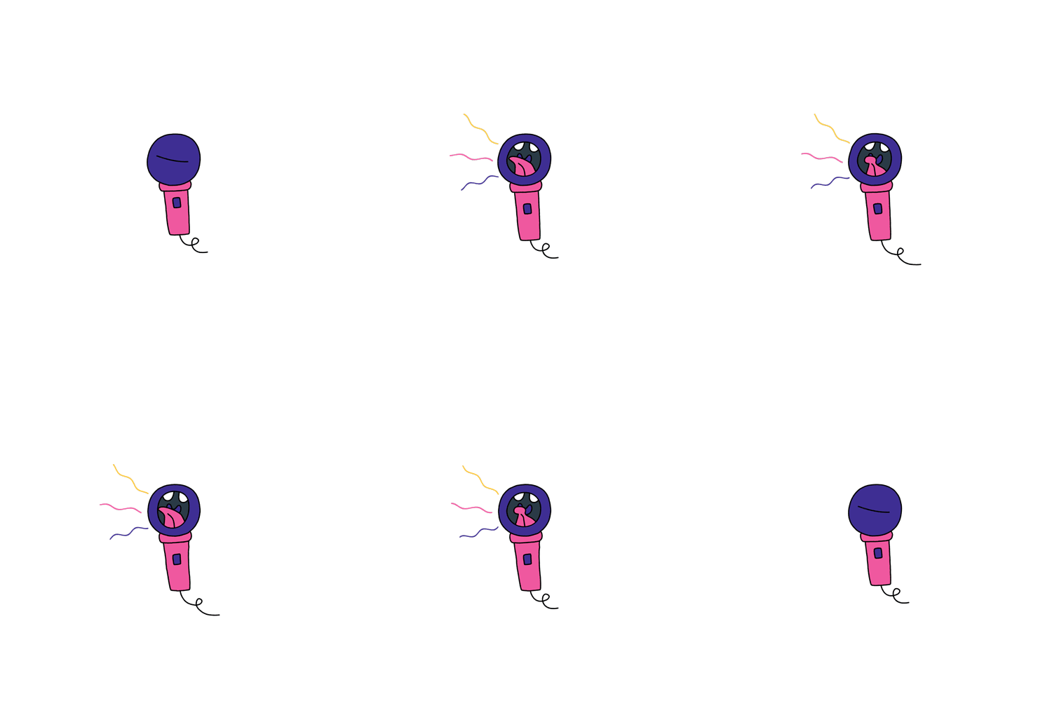
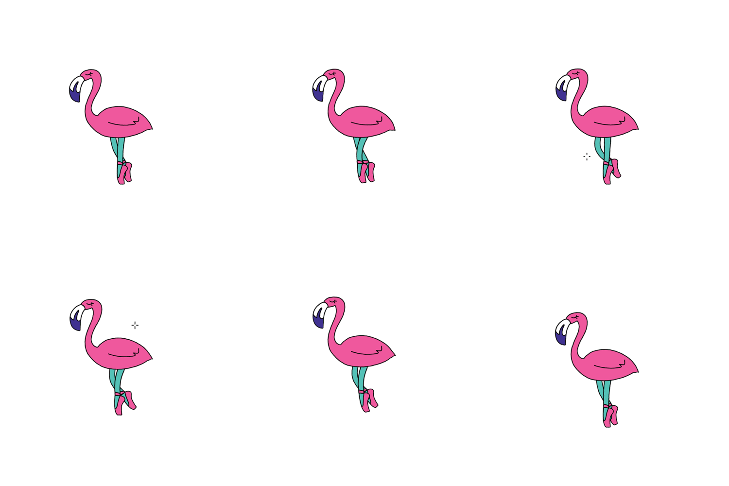
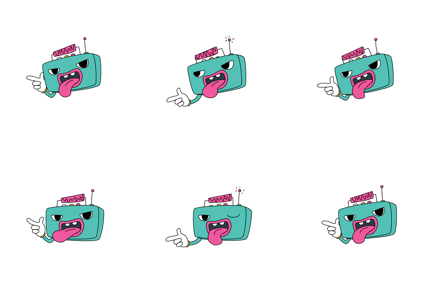
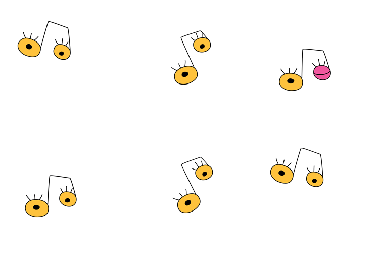
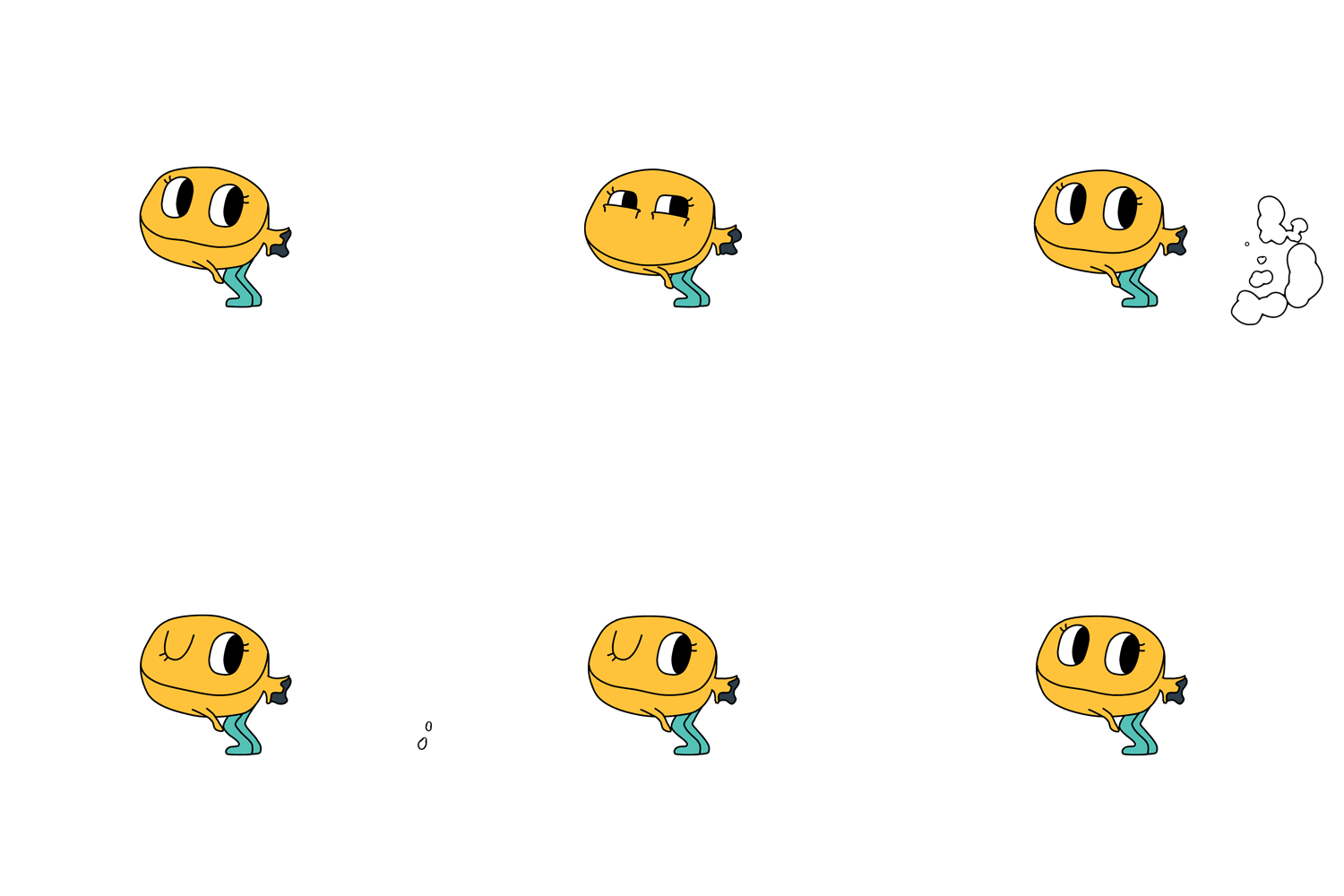
Stickers were a key component to the campaign. Not only for social, but broadcast too. It was important for the stickers to to keep with the theme of big, bold, and weird.
After much brainstorming and many laughs we were able to create a set of stickers to embodied the spirit of Spotlight. The good people at Dydree in Berlin helped us bring our visions to life by designing a package of stickers to create our crazy fun world.


 |  |  |  |  |  |  |  |
|---|---|---|---|---|---|---|---|
 |  |  |  |  |  |  |  |
 |  |  |  |  |  |  |  |
 |  |  |  |  |  |  |  |
 |
